
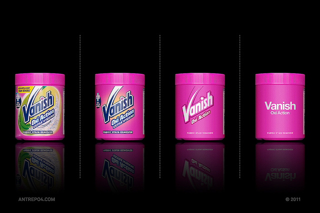
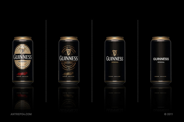
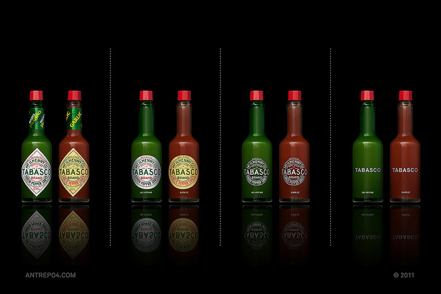
Gegen die visuelle Überforderung von Produkten und Lebensmitteln im Supermarkt-Regal! Das Produktdesign auch in reduzierter Form funktioniert, ohne gleich die Identität der Marke zu gefährden, wird mit diesem Projekt eindeutig und elegant bewiesen.
When we went to the supermarket in our last trip to London, we’ve noticed that, “Our packaging project could go to next level”. This second edition has one more variation and now, we are showing all brand names with simple text & same font, without logo or corporate sign in it. The font is Helvetica Neu Bold […] antrepo4.com
…und hier gibt es den Rest, sogar als High-Res Daten: Antrepo4 Flickr Channel
[poll id=”2″]
1 Comment
Join the discussion and tell us your opinion.
Sehr gut, siehe Pepsi es fragt sich nur was die Weiterentwicklung danach bringen wird…
Der Supermarkt Waitrose macht es schon komplett bei seinen Eigenmarken
http://cmykern.com/wp-content/uploads/2008/11/22_gold_waitrose_herbs_5.jpg